The Country Club Traditional Project was all about bringing a modern and clean feel to our clients traditional space. She was excited for our fresh approach and we're happy with how it turned out! Watch the webisode and see the process!
Before

Before, the living room and dining room were flip flopped. We switched them for a better flow.


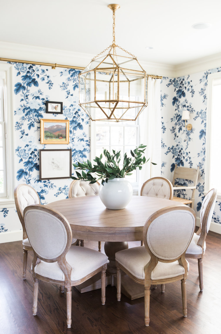
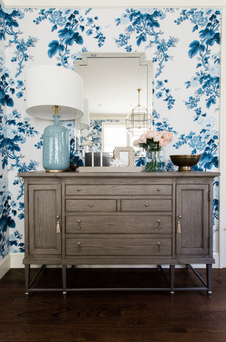
Our client loved blue and white, and we've been eyeing this floral wallpaper for a while. It was perfect for this project! Adding in pattern with wallpaper really works in smaller spaces like powder rooms, nurseries, and kids rooms. It brings color and personality to a formal setting.


In a square room like this one, round tables really help make the space easy to navigate and walk through.


This home has adjacent rooms that open up to each other. When that happens, we'll pick a color to be dominant in one and an accent in the other. The blue lines in these custom curtains in the living room reference the blue wallpaper in the dining room.


Pay attention to textures when decorating a living room. We layered a cow hide over a sea grass rug to make the space feel natural and cozy.


We added some blush sea glass beads to bring in some coastal vibes that our client wanted. They look so great next to the gold feather magnifying glass. We love the big lively leaves on the Fiddle Leaf Tree and love the fact that we can't kill it.


Our client loves a classic ginger jar. Since her dining room is now one big beautiful ginger jar, we placed some in her living room to tie it all together.


Original article and pictures take www.studio-mcgee.com site
Комментариев нет:
Отправить комментарий